


That morning coffee run isn’t so simple anymore. Popular apps like Starbucks are accused of using tricky design tactics that intentionally confuse users into spending more money.
Consumer advocacy groups protest Starbucks mobile app forcing customers to add $10 to gift card balances or forfeit remaining cents. This creates a pattern of rounding up balances to the nearest $5 or $10 to prevent fractional spare change. Critics call this a “dark pattern” – deceptive design duping users into purchases benefiting companies over individuals.
And Starbucks is far from alone. With India’s online community approaching 900 million users by 2025, authorities are taking action against dark patterns they believe wrongly influence consumer choices.
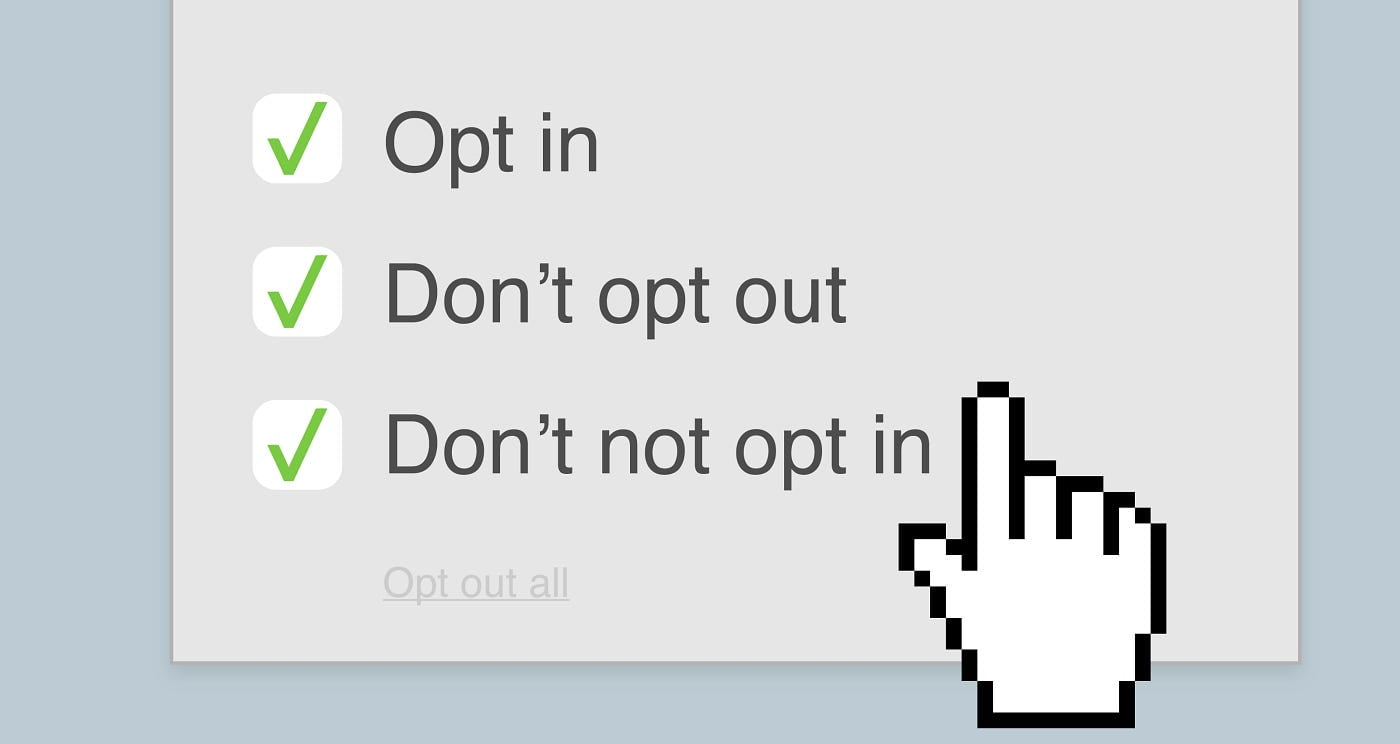
What are Dark Patterns?
Dark patterns are user interface designs that subtly guide users into making certain decisions. While not always malicious, these sly “nudges” often encourage choices benefiting companies at the individual’s expense.
(Source)
The psychology behind dark patterns
Dark patterns exploit common quirks in human thinking. Designers apply behavioral science to sway choices advantageous to companies rather than customers. These mental “brain bugs” make us vulnerable:
- Fear of Missing Out (FOMO) – Creating illusion of scarcity compels quick purchases. Countdown timers until offers expire or limited inventory warnings push buyers worried items will sell out.
- Defaults & Friction – We stick with preselected options rather than actively changing settings. Disabling unwanted services or notifications requires tedious effort so most accept defaults.
- Reciprocity – When given something, we feel an obligation to give back. Free gift cards with first-time purchases lead to return trips and rewritten shopping habits.
- Saving Face – Admitting we were wrong sticks in our craw. Buried account deletion links force publicly engaging support for help, deterring some.
- Sunk Cost Fallacy – Time already invested is tough to abandon, keeping us in poor processes. Long personality quizzes before job applications still get finished even if the position seems wrong.
10 Most Common Types Of Dark Patterns
1. Roach Motel
Signup is quick and easy while cancellation is a tedious maze of obstacles. Companies hope the headaches in quitting wear down customers into staying subscribed.
For example, Amazon previously required email confirmations and explanations why a user wanted to close their account. Only 14% of the users could cancel their prime membership at one time. This retention from frustration translated into enormous profits. This was later sued by the FTC.
2. Sneak Into Basket
You add a single item to your cart, only to find extra services, warranties, or memberships secretly included at checkout. Now you must spend time deleting the upsells you never wanted before paying.
Hotel and flight booking sites frequently add extras like travel protection or carbon offsets hoping rushed customers won’t notice.
(Source)
3. Confirm shaming
Using guilt trips to dissuade cancellation. Imagine unsubscribing from cute animal memes only for a pop up pleading “Are you sure? The otters will miss you!”
Streaming services like Netflix are accused of confirming shaming by asking “Are you still watching?” when shows play continuously, pressuring marathon viewers.
4. Hidden Costs
Advertising one main price upfront then revealing additional fees later in the checkout process, counting on customers not wanting to start over after investing time already.
For example concert tickets that hit users with service charges after seat selection.
5. Activity Message Spam:
Incessantly sending “nudge” messages about other users’ activity to drive engagement.
For example, LinkedIn prompting “So-and-so viewed your profile” repeatedly to compel revisits.
6. Nagging
Bombarding users with pop-up or email reminders to return to temporarily abandoned checkout carts or claim expiring coupon offers, hoping to wear down resistance.
7. Activity Highlight
Deliberately inflating progress stats like step counts or time spent to keep users feeling productive.
For example, step count apps showing double the actual daily steps taken.
8. Prize Burying
Presenting conditional offers so buried in fine print that take extensive effort to collect the promoted reward.
For example, cash back sites with redemption requirements hidden across complex terms and conditions.
9. Trick Wording
Using confusing language to steer choices.
For example, checkout buttons labeled “Buy Now, Pay Later” when they actually create loan financing agreements.
10. Friend Spam
Automated invites making it appear a contact has individually endorsed something.
For example apps suggesting a user’s entire contact list join before allowing declines.
While major players like Facebook, Microsoft, and Google deny malicious intent, critics believe dark patterns mislead users into paying more, sharing excessive personal data, or wasting precious time fighting confusing menus.
And business is booming. Experts estimate $100 billion plus in revenue yearly linked to dark pattern interfaces. With growth outpacing legislation, authorities are playing catch up.
Dark pattern designers rely on cognitive blindspots that let our brains play tricks on us. But informed consumers can spot and resist their tactics.
Dark Patterns Case Study 1: Slack’s Tricky Ticketing
Workspace chat app Slack rolled out system changes making it harder to file complaints. Support ticket creation required multiple complex menu clicks users struggled to locate.
Critics argued Slack deliberately buried complaints to limit negative PR around security issues, system outages, and billing problems. Most users gave up searching for the ticket form. PR disaster contained.
After fiery backlash, Slack returned ticket creation to more visible locations. But the move highlighted priority corporations place on damage control over accountability.
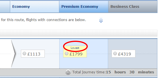
Dark Patterns Case Study 2: Hotel Resort Fees
Popular travel sites display enticingly low room rates…then reveal mandatory “resort fees” later in the booking process. These daily charges for amenities like pool access or gym use quickly multiply costs.
Yet sites tout the base prices in bold fonts across search pages knowing lower numbers reel browser interest. Expecting customers invested in the process won’t abort bookings once the actual prices appear, sites maximize views through false impressions.
This bait-and-switch tactic continues despite lawsuits and regulations against hidden fee practices in industries like airlines. With billions in added revenue, hotels accept rare wrist slap fines as a cost of business not a deterrent.
India Takes Action Against Dark Patterns
India aims to step up protection with stern new warnings to enterprises using dark patterns or similar exploitative tactics. Violators now face escalating consequences including legal action. Complaints also funnel to the Central Consumer Protection Authority capable of financial penalties.
Tighter regulations may emerge after ongoing review as India expects nearly double internet users in coming years. Critics argue the ambitions of Big Tech increasingly conflict with individual rights. Just as false advertising misleads consumers, dark pattern site design wrongly sways daily choices.
Others debate regulating design complexity in fiercely competitive industries. Can creativity flourish if guided by stricter rules? Either way, public awareness offers the best defense for now.
Do you want us to design an e-commerce website for you that stays in line with proper guidelines and laws but one that will convert best? Get in touch with us today